Creative Energy Branding
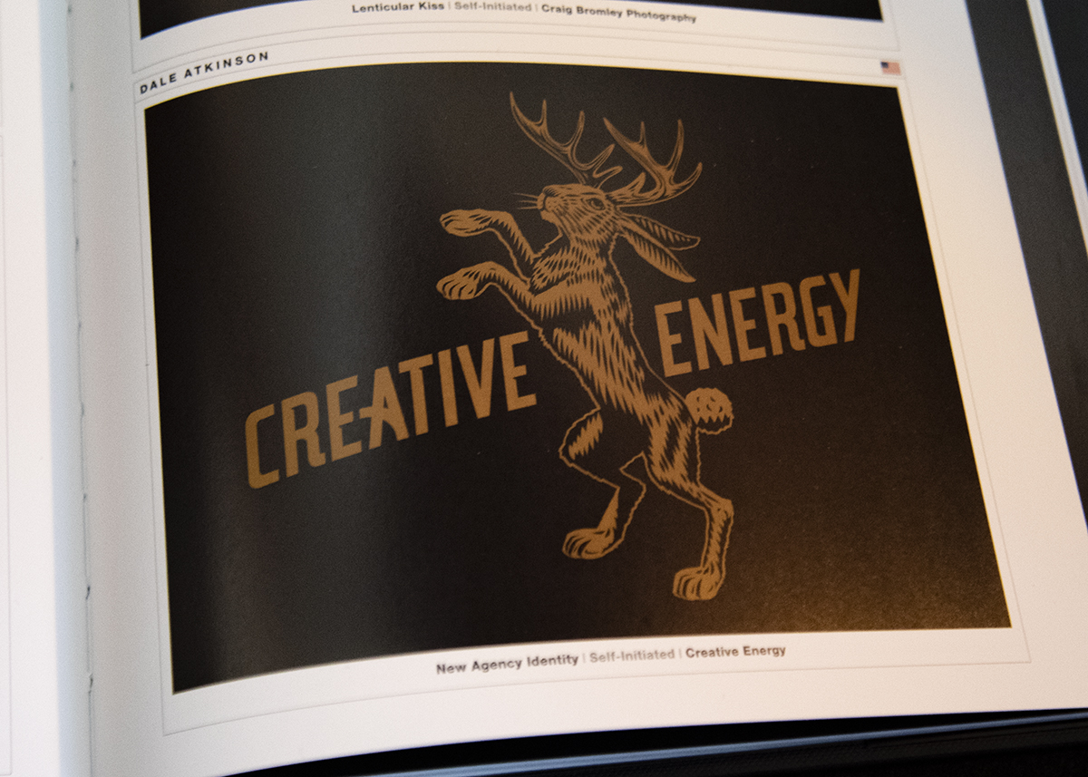
Rebranding is one thing, but rebranding a branding agency is quite another. It is one of my most memorable accomplishments.
I initially started toying with all sorts of ideas related to what a creative agency is, what one means to clients, and how the creative process works. As I explored ideas and worked through sketches, a few related themes kept popping up.
Often clients and non-creatives refer to creatives as “wizards” or “magicians” because they don’t know how we do what we do. I personally like to play into the idea a bit when presenting ideas, walking the audience through the everything that supports the idea, leading up to a theatrical reveal like a magician pulling a rabbit out of a hat.
But it’s not magic. It’s hard work. We do research, travel different trains of thought, and go down labyrinthine rabbit holes in the pursuit of ideas.
Then, once we creatives come up with a solution we think will successfully elevate a brand or product, sometimes the clients are skeptical or scared to try something they might feel is risky or too adventurous, but we ask them to take a leap of faith.
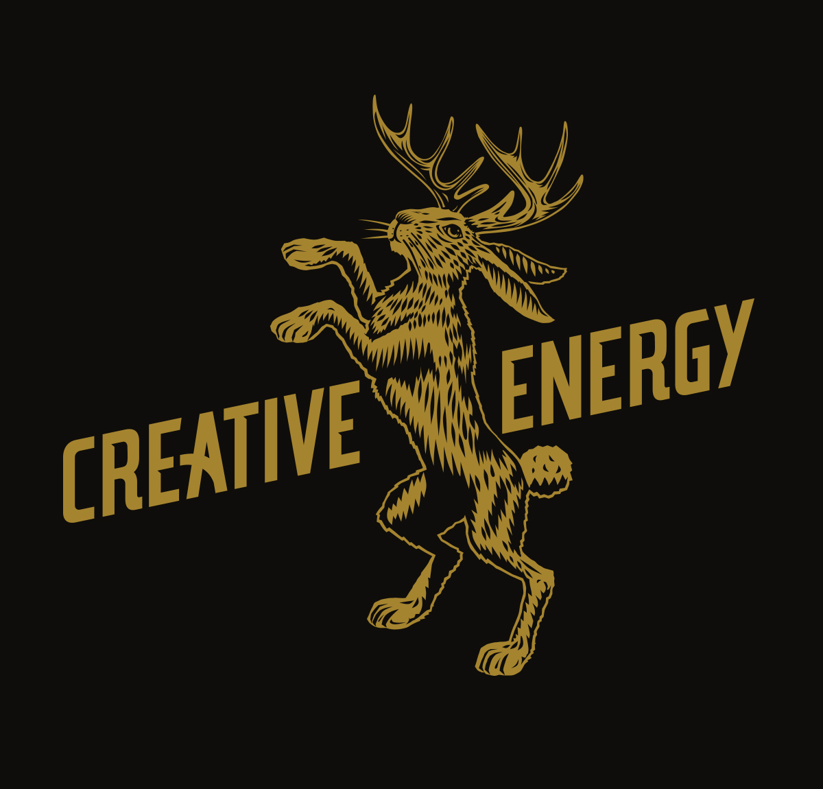
I noticed “rabbit” and “leaping” themes recurring and thought that perhaps a rabbit might make a fun symbol or totem for Creative Energy. After presenting the idea to the team, we thought about going ahead and adding horns, transforming the rabbit into a Jackalope, giving the figure a whimsical, mythical feel and offer a nod to regional folklore. The team liked the result and with some typgraphic treatment, the Creative Energy Jackalope was born.
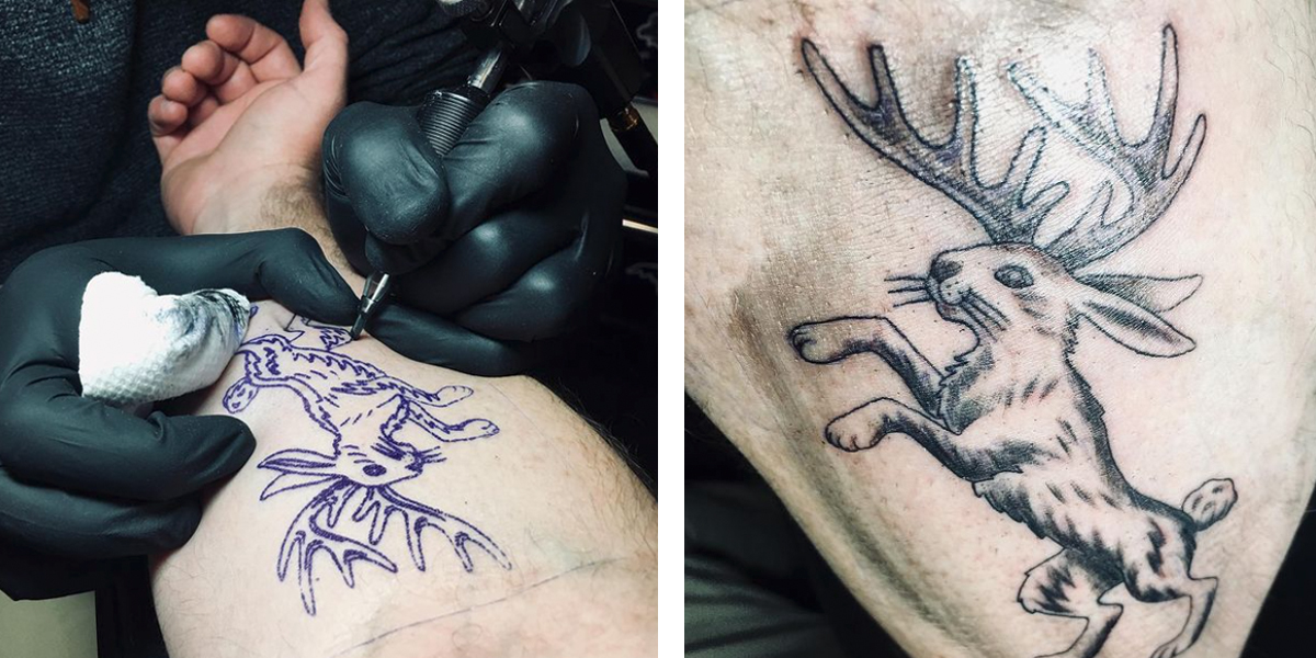
The staff has fully embraced Jackalope culture as well. While most employees regularly wear Jackalope-branded apparel, one actually got a Jackalope tattoo. We also sometimes call the group the “Flaggerdoot”, the name for a group of Jackalopes.
The rebranding was success and was cemented when Creative Energy was awarded Ad Age Small Agency of the Year just a few months later and our new logo was seen by the world complete with a new accolade.


