Volunteer Vodka Label
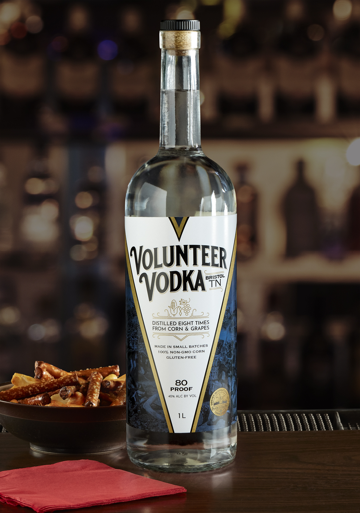
Volunteer Vodka is the flagship spirit from Appalachian Heritage Distillery, based in Bristol, TN. They came to us for several design options and potential directions. This offering presents Volunteer Vodka as a premium, top-shelf product of distinction and craftsmanship. While the bottle shape, cap, and label dimensions were decided before I came onboard, there was still opportunity for great things within the label. Much in-depth research and thoughtful design considerations contributed to the final design seen here.
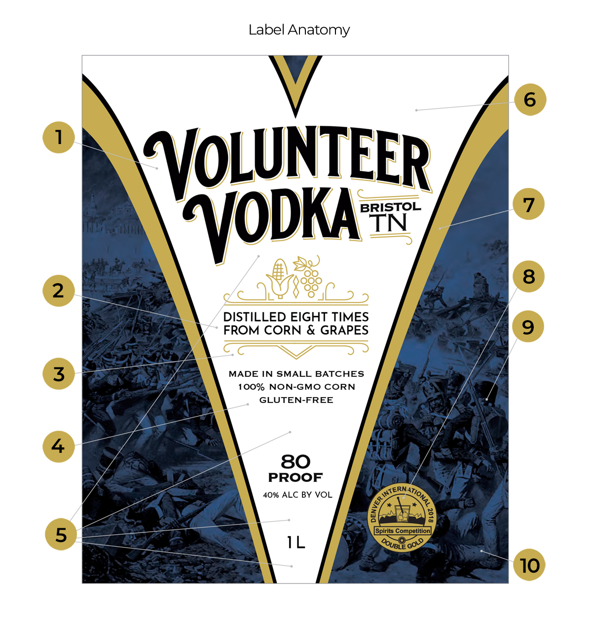
Anatomy:
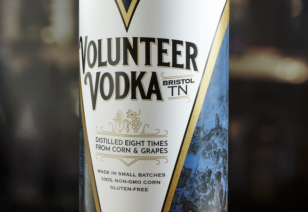
1- The logo has been tastefully crafted and customized, just like the vodka itself, to communicate the premium quality of the product within, made with painstaking attention to detail and thoughtfulness in aesthetics. It is coupled with “Bristol TN” to emphatically bring home the specificity and authenticity of its Tennessee roots.
2- Decorative elements have been designed in a lockup to highlight the process and ingredients from which this vodka is made. Included are a charming illustration of corn and grapes with a “Double-Diamond” icon between them that also mimics the number “8”. This cleverly symbolizes the type of still used to create the vodka, which is know in the industry as a Double Diamond. It doubly emphasizes that the spirits have been distilled eight times to ensure purity and superior flavor. This lockup can be used separately in other graphic applications as well, such as on the website, or promotional collateral.
3- Subtle Art Deco type and styling to this lockup, the Volunteer Vodka logo, and the design overall is a tasteful nod to the prevalent style during the Prohibition Era, in which Appalachian Heritage Distillery is firmly rooted.
4- Secondary benefits and selling points are clear, but without being obtrusive, taking a backseat in the information heirarchy to other, more important elements.
5- Clear space has been intentionally left to offer flexibility so this design remains visually consistent and recognizable, even if elements have to be moved closer or further vertically to accommodate labels for smaller or larger bottles.
6- Distinctive “V” negative middle shape serves to encourage immediate name recall by reminding the customer of the “V”s in the name “Volunteer Vodka. ” This helps in “stickiness” of memory, which is very important to a new brand. More importantly, its unique shape helps in visual recall and recognition on the store shelf during a purchase decision, or when specifying vodka in a bar or restaurant because the shape can be clearly identified from a great distance, quickly informing the customer that it is available.
7- “V” shaped is bordered with a metallic foil the color of new copper to symbolize the copper stills in which the vodka is made.
8- The “V” shape also offers utility of space on the sides in which award emblems, other accolades, qualities, or temporary labeling can be tastefully nested without compromising the integrity of the main branding/information area within the “V.”
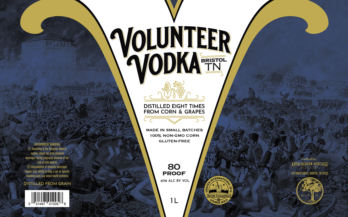
9- The outside space depicts a battle from the War of 1812, where the Tennessee Volunteers earned their name and served their homeland. While Appalachian Heritage Distillery has a wonderful, colorful, storied history in and of itself, here we have chosen to focus on the story from which this Vodka itself is named. This is Volunteer Vodka. While there may be a time and place for all of the Appalachian Heritage Distillery back-story more conspicuously later, an effective label, especially for an emerging brand, should focus clearly on the essence of the product contained, quickly communicate its qualities, and hold to a primary narrative which can be easily understood without confusion or an overwhelming clutter of messages.
10- This color/treatment is flexible in that it can be changed to other colors or scenes should Volunteer Vodka decide to offer other flavors or variations, without disturbing the main branding/information area.
The client ultimately went in a more folky direction, but were very impressed and dazzled by this option, nonetheless.


